As a forward-thinking company, we use motion across animations and graphics to evoke our passion for progress. Find the full guidelines for films and digital channels here, including innovative ways to capture the smoothness of a Finnair flight using design.
Motion
Motion language
Our primary direction of movement is horizontal, from left to right. This creates a clear sense of direction and is an indicator of going forward. This horizontal movement can be reversed in order to indicate going backwards (e.g. to a previous state).
Our motion language is a visual manifestation of the smoothness of traveling with Finnair. By applying our motion language, we create and secure a consistent movement across all Finnair brand materials.
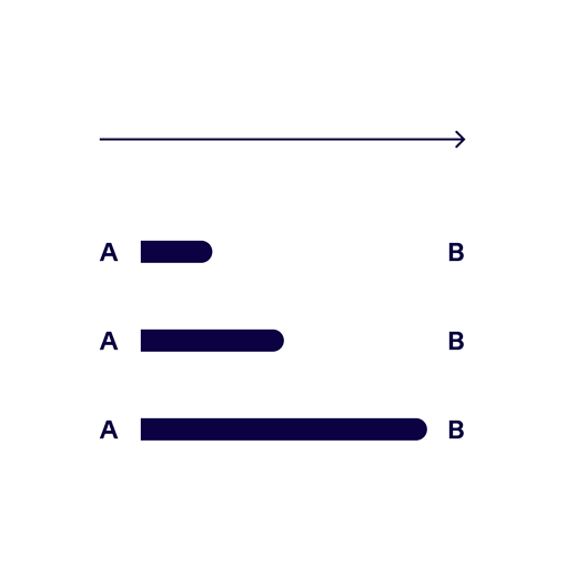
Primary direction
Forward
Indicates going forward and creates a clear sense of direction.
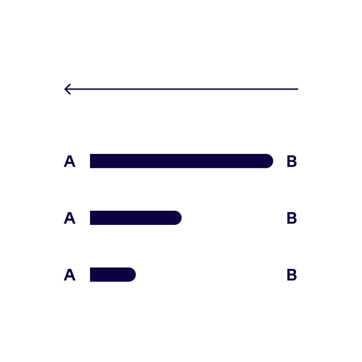
Secondary direction
Backward
Indicates going back to a previous state or cancelling a function.
Our motion language in use
The movement of elements should be smooth and calm. By animating one object at a time, in an orderly sequence, we avoid creating a hectic experience.
Use cases
Text animations
Text appearing into the frame is a useful way of directing focus to the most important information. Animated text should be used in all digital channels that enable motion.
Headlines
Headlines are used throughout all channels. Animated headlines are a good way of grabbing attention. The primary direction of movement for headlines is horizontal. The text should appear smoothly by fading in from the left and exiting to the right.
Single-line headline
Appearing from the left and exit to the right
Multi-line headline
Appearing in a sequence from the left and exiting to the right
Super text
Supers are both horizontally and vertically centered texts that can be either superimposed on the underlying footage or appear on a single colour background. These can be e.g. slogans, call-to-actions etc. Supers appear with a slight and smooth movement from the left and exit to the right. The text should be left in the frame for a sufficient amount of time to enable easy readability.
Single-line super text
Appearing from the left and exit to the right
Multi-line super text
Appearing in a sequence from the left
Lower thirds
Lower thirds are superimposed text in the lower third of the screen. These texts are for example used to identify a person or location on screen.
Single-line lower third
Left-aligned single-line text appearing from the left.
Multi-line lower third
Multi-line text appearing in a sequence from the left and exiting to the right.
Digital channels
Our digital channels are varied. With a consistent use of motion we secure a smooth and coherent digital experience throughout all channels.
Modals
Modals appear to grab attention and direct the users focus. These and similar elements should appear smoothly but quick enough to reduce waiting time.
Modals – opening & closing [Accept]
Modals fade-in with a slight movement from the left. When choosing and accepting an option, the modal exits to the right to indicate moving forward.
Modals – opening & closing [Decline]
When closing without choosing an option the modal exits to the left indicating the return to a previous state.
Mobile modals
Although the horizontal space on mobile devices are more limited than on desktop, the same rules apply. The horizontal movement can be slighter.
Mobile modals – opening & closing [Accept]
Modals fade-in with a slight movement from left to left. When choosing and accepting an option, the modal exits to the right to indicate moving forward.
Mobile modals – opening & closing [Decline]
When closing without choosing an option the modal exits to the left indicating the return to a previous state.
Notifications
By animating notifications, we direct the users attention to important and highlighted information.
Notifications – in & out
Notifications appear by pushing down the content below with the notification text fading and sliding in from the left. When closing the notification module the user indicates receiving and accepting the information and the module exits to the right.
Pop-up notifications – in & out
Pop-up notifications appear on top of the content by sliding in from the left. When closing the notification module the user indicates receiving and accepting the information and the module exits to the right.
Cards
Cards and similar elements make an exception to the rule of horizontal movement; these elements appear from right to left in order to indicate more content on the right-hand side. Scrolling from left to right is the natural direction and intuitive user behaviour.
Cards
Cards appear in a sequence from the right in order to indicate more content.
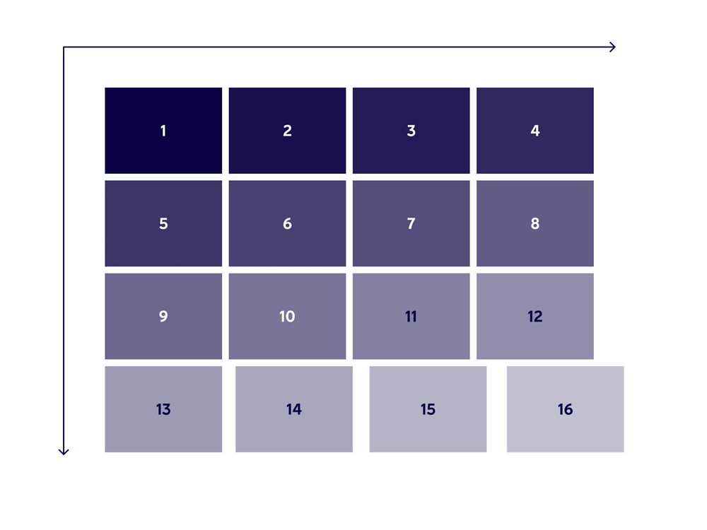
Loading of elements
Loading of elements are another exception to the rule of horizontal movement. Depending of the function of the page, elements should load from left to right, top to bottom in a sequence with a slight fade in and possibly horizontal movement. Loading from left to right, top to bottom is an intuitive behaviour and expected by the user.
Loading order of elements
Left to right, top to bottom
Re-ordering of elements
When sorting or shuffling items, always use rounded corner paths to visually organise the movements.
Re-ordering of elements
Re-ordering with guidelines
Campaign elements
Use slight movement to highlight and direct attention to campaign elements.
Additional elements
Use motion to direct focus and indicate different states of progress. Animated elements are strong visual indicators to prompt the user to take action and complete their journey.
Buttons
Animated buttons help the user move forward.
Scrolling numbers
A clockwise, progressive movement to indicate a growing number of Finnair Plus ward points.
Films
To create a sense of smooth travelling and to keep things calm we avoid erratic or heavy movement in films. Gimmicky transitions between footage should also be avoided. Dissolve or simple cuts are preferred.
Checklist for the motion language
- All motion should be functional and simple
- Use motion to direct attention
- The primary direction of movement is horizontal
- Left to right indicates going forward
- Right to left indicates going back
- Only animate one element at a time
- Multiple elements should move in sequential stages
- Keep the motion language consistent
- To avoid feeling hectic, keep everything as smooth and calm as possible
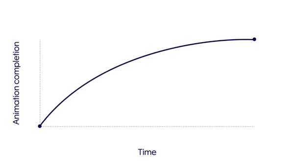
Easing and timing
To create smooth transitions we use easing functions. Easing defines how an animation changes speed over time. Consistent easing is key for having coherent motion across all use cases. There are three main Finnair easing functions:
- Ease-in
- Ease-out
- Loading
In user interactions, we should try to keep animations & transitions smooth but short and responsive. Depending on the covered distance and the size of the animated element, the duration of the animation may vary.
- Micro transitions: 100–230ms
- Regular transitions: 150–350ms
- Big transitions: 230–450ms
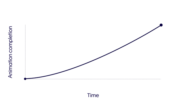
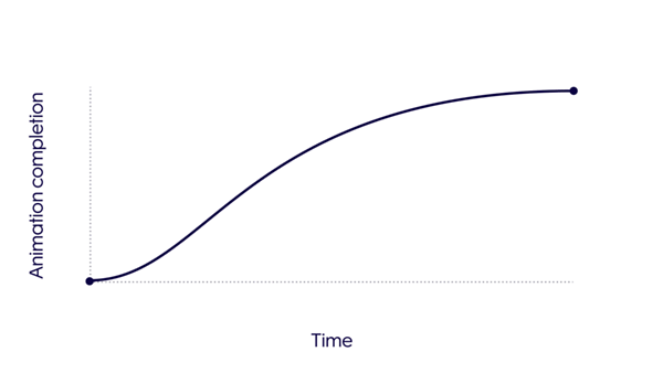
Easing
1. Finnair ease-in
When a user interacts with an element you should use the Finnair ease-in easing function.
Finnair ease-in: 0.10, 0,25, 0.55, 1.00
2. Finnair ease-out
When the interaction ends you should use the Finnair ease-out easing function.
Finnair ease-out: 0.55, 0.25, 0.55, 1.00
3. Finnair loading
When there is no immediate interaction and you need to transition & animate elements use the Finnair loading easing function.
Finnair loading: 0.40, 0.20, 0.80, 1.00
Read next