Illustration
Carefully stylised, functional and stunningly simple, our illustration style conveys the desired information and strongly reflects our brand character. Discover here the guidelines for our illustration style.
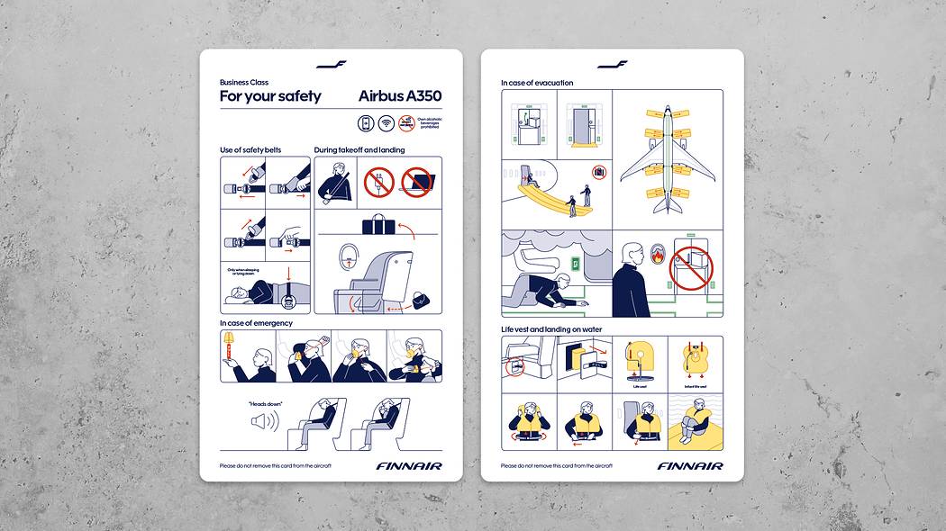
We use illustrations mainly where other imagery styles don't serve the purpose. Typical examples of the use include our Safety cards and annual reports. To create content in this style, make sure to involve the Finnair Brand team from the start.
Illustration style
The style of our illustrations builds on our design drivers that capture our expertise and Nordic character. Here are the elements that form the core of our recognizable illustration style.
Form
Based on Finnair Sans
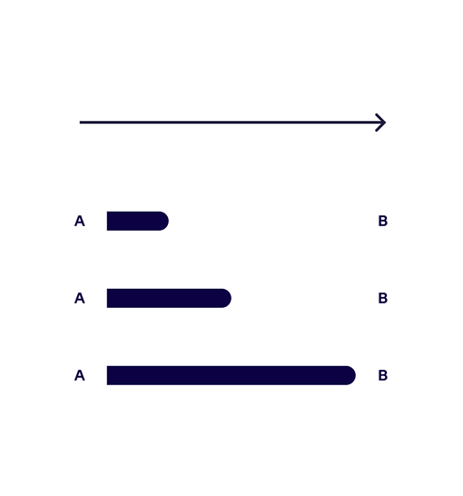
Forward moving line
Open outlines
Clean
Minimal use of colour
Functionality
Simplicity
Practical
Informative
Tonality
Human
Positive
Fresh
Round shapes and geometric feel of the illustrations are based on the brand font Finnair Sans.
Round shapes and geometric feel of the illustrations are based on the brand font Finnair Sans.
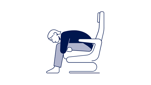
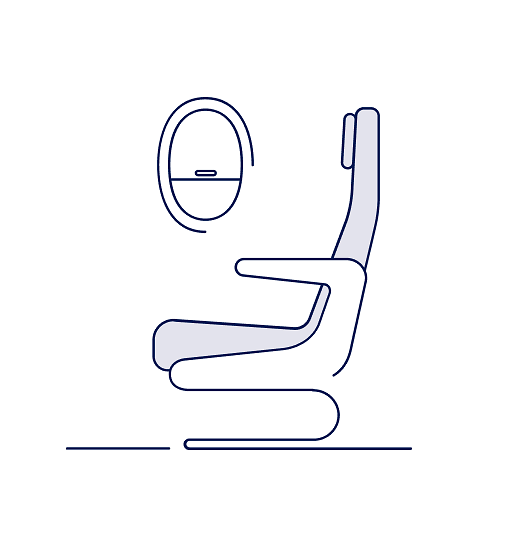
Some of the elements appear to be drawn with a single line. Illustration is always created with a minimal colour palette.
Stroke indicates going forward, simultaneously creating a clear sense of direction.
Characters
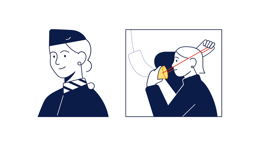
Characters are friendly and polite, interacting with relaxed expressions and smiling faces. Characters should represent a diverse range of people. Clothing is simple and reflects our minimalist Nordic style. Facial expressions are easy to understand.
Representation
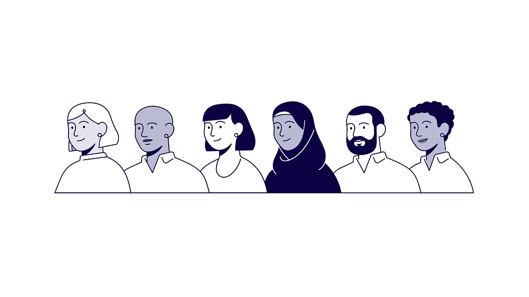
Equality, diversity and non-discrimination are a natural part of our fundamental values and this should be reflected in our illustrated characters. Individual features are expressed subtly and different skin tones created using tints of Finnair Blue.
Colour
We use Finnair Blue and its tints as primary colour, both in strokes and in fill colours. If the background is dark, we use white as a stroke colour. The functional colours from our Digital colour palette are used to highlight important information.
Primary colours
Finnair White
HEX #ffffff
RGB: 255, 255, 255
CMYK C: 0, 0, 0, 0
CMYK U: 0, 0 ,0, 0
RAL 9003
Finnair Blue
HEX #0C0243
RGB: 12, 2, 67
CMYK C: 100, 80, 0, 65
CMYK U: 100, 80, 0, 45
Newsprint CMYK: 100, 70, 0, 40
PMS 2767 C
RAL 5026
Tints
HEX #BBBCD4
CMYK C: 26, 23, 5, 0
HEX #E4E4EE
CMYK C: 10, 8, 2, 0
Functional colours
#2A8953
CMYK 82, 22, 79, 6
#A4DEBA
CMYK 40, 0, 36, 0
#FFC701
CMYK 18, 50, 100, 6
#FFDF7B
CMYK 0, 10, 60, 0
#9F0000
CMYK 23, 100, 100, 23
#DA3119
CMYK 7, 91, 98, 0
Colour usage ratio
Executions are created predominantly with Finnair Blue and white. Functional colour proportion of the whole should be no more than 1%.
Main stroke colour is Finnair Blue.
Fill colours are tints of it.
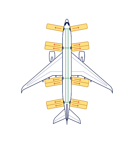
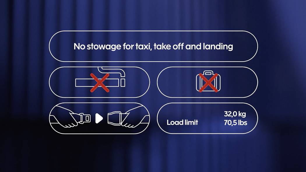
Example of functional colours in use.
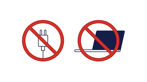
Example of red functional colour in use.
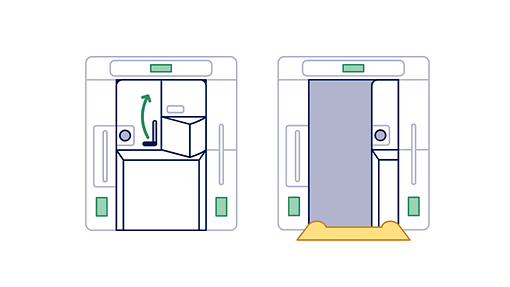
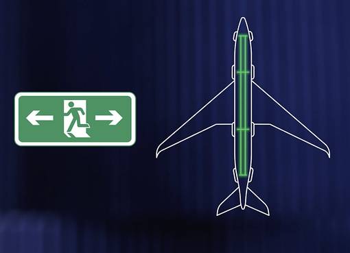
Example of green and yellow functional colours in use.
Stroke
The size of the stroke should be uniform throughout the illustration. However, if a thinner or thicker line is required, the thickness should be 50% or 200% of the basic stroke. The tip of the stroke should always be rounded.
Illustration on moving image
Follow the Finnair Motion guidelines for animation style.
Examples of illustration on moving image