Our iconography is clear and inclusive, from first click all the way to the aircraft cabin. Find complete guidelines for using this new set of functional, elevated icons, designed to reflect the updated Finnair visual language.
Iconography
Visual language
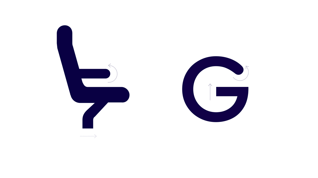
The visual language was built from the typeface Finnair Sans. The iconography follows the typeface's aerodynamic movement and shapes. For instance, the alteration between the rounded and the squared tip.
Construction
All icons should be drawn on a 32 x 32 px grid frame, with outlines having a stroke width of 2 px. As a guide, each frame has keylines and a 2 px padding on all sides. However, if going beyond the padding or off the keylines improves the optical balance of the icon, it is acceptable. Create icons that can be viewed at 100% scale for pixel-perfect accuracy.
Layout
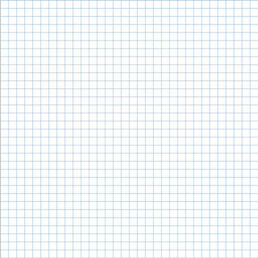
The icons are created in a 32 x 32 px grid frame, with a 2 px trim area outside the live area. The icon grid establishes clear guidelines for the consistent but flexible placement of graphic elements.
Live area
Icon content is limited to the live area of 30 px x 30 px.

Padding
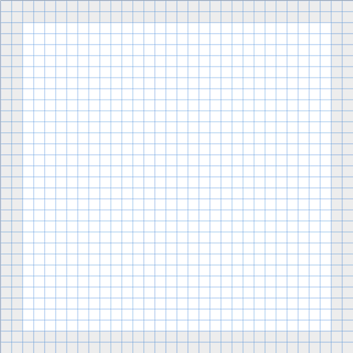
With 2 px padding around the live area.
Keyline
Certain shapes have unique keylines, such as circles, squares, rectangles, orthogonals, and diagonals. These basic shapes help to unify the icon's design and regulate its placement on the icon grid. While using the grid to create keyline shapes, you can maintain consistent visual proportions throughout the icons and use these core shapes as a baseline.

Layout


- Stroke terminal
- Corner
- Counter stroke
- Bounding area
Corners
Corner radiuses are set to 2 pixels by default. Interior corners should be square rather than rounded.


Stroke
Icons, including curves, angles, and both interior and exterior strokes, have a consistent stroke width of 2 px.

Maintain a consistent stroke weight, and round the stroke terminals to reflect the aerodynamic movement.

To maintain the best possible icon legibility, the UI iconography should be drawn outlined.
Implementation
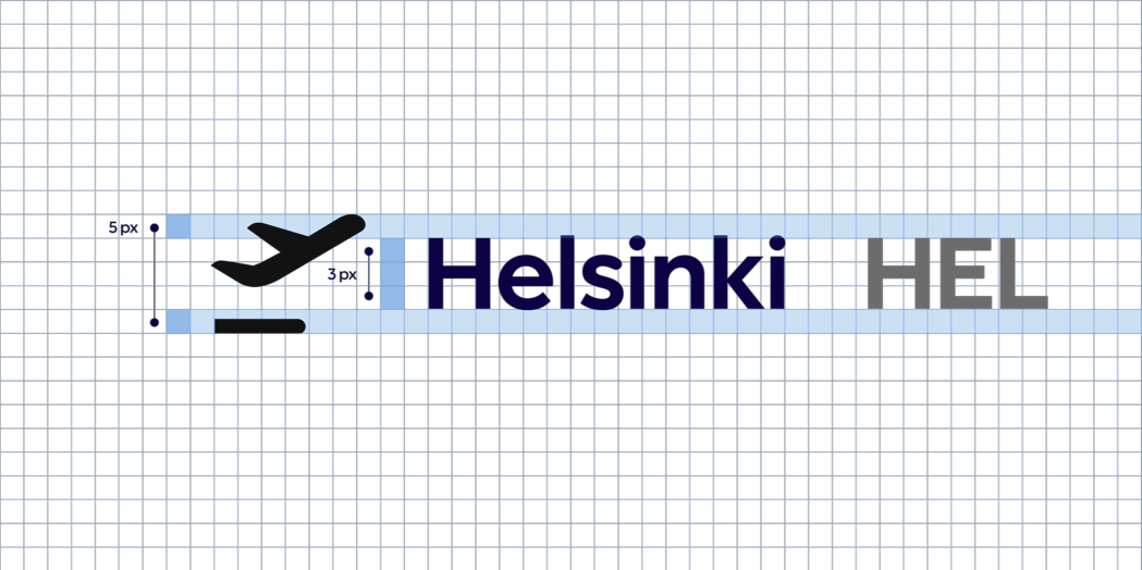
To keep the hierarchy distinct, icon height should be 2 px higher than the text height.
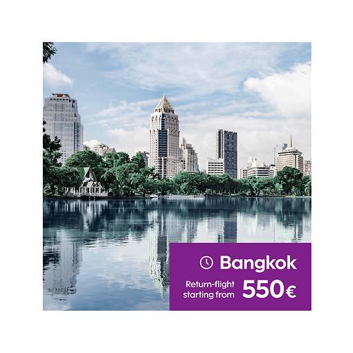
Advertising banners example
Read next