Colours

Stunningly simple, modern and trustworthy, our Finnish soul is celebrated in the iconic blue and white colours of Finnair. Compliment this pair with a selection of distinctive colours inspired by the Nordic landscape. Explore our clear colour system and discover the entire digital palette, here.

Master palette

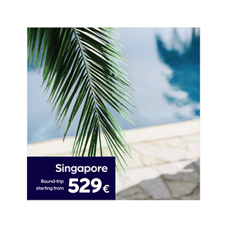
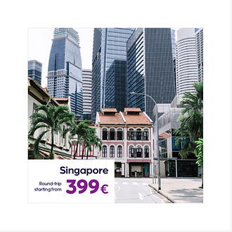
Master palette is a combination of clean Finnair White and iconic Finnair blue. In addition to this we have selected shades of grey and energetic Heather to draw attention.

Finnair White

HEX #ffffff

RGB: 255, 255, 255

CMYK C: 0, 0, 0, 0

CMYK U: 0, 0 ,0, 0

RAL 9003

Finnair Blue

HEX #0C0243

RGB: 12, 2, 67

CMYK C: 100, 80, 0, 65

CMYK U: 100, 80, 0, 45

Newsprint CMYK: 100, 70, 0, 40

PMS 2767 C

RAL 5026

Finnair Heather

HEX #7F1F89

RGB: 127, 31, 137

CMYK C: 60, 100, 0, 0

CMYK U: 60, 100, 0, 0

Newsprint CMYK: 50, 100, 0, 0

PMS 2612 C

Finnair Rock

HEX #AFAFAF

RGB: 175, 175, 175

CMYK C: 0, 0, 0, 40

CMYK U: 0, 0, 0, 35

Newsprint CMYK: 0, 0, 0, 30

PMS Cool Gray 6 C

PMS Cool Gray 5 U

RAL 7040

Finnair Black

HEX #121212

RGB: 18, 18, 18

CMYK C: 0, 0, 0, 100

CMYK U: 0, 0, 0, 100

Newsprint CMYK: 0, 0, 0, 100

PMS Black C

PMS Black U

RAL 9017

Guidance

HEX is the value provided for digital applications along with Pantone® and CMYK values for print and RAL colors for painted surfaces.   

Colour system

The foundation for the Finnair brand colour system is built on inheritability. The master palette is simplistic, containing colours that are linked to our legacy. Subpalettes are based on the parent palette, but they are expanded to meet the requirements of specific use case.

Colour usage

To achieve the right feeling and tone, the balance and proportion of colours should always be carefully considered. Negative/white space is vital for creating the modern and airy feel of the Finnair brand.

Proportions

60%
35%
5%

Finnair White

Main titles

Finnair-colours-finnair-white-main-titles

Main background colour

Finnair-colours-finnair-white-main-background

Finnair Blue

Bodytext main colour

Finnair-colours-finnair-blue-main-bodytext

Background colour for text blocks

Finnair-colours-blue-background

Data visualisation colour

Finnair-colours-finnair-blue-data-visualisation

Finnair Heather

Typography accent colour in marketing

Finnair-colours-finnair-heather-typography-accent

Price driven marketing campaign stripe

Finnair-colours-finnair-heather-campaign-stripe

Data visualisation accent colour

Finnair-colours-finnair-heather-data-visualisation

Finnair Rock

Graphics and illustration

Finnair-colours-finnair-rock-graphics

Digital colour palette

The new palette can be divided into brand and functional use. Brand colours make the design recognisable and functional colours are being used to guide the user. In practice this means that 99% of the colours are brand colours and 1% are functional colours for guiding users in cases such as errors or success notifications.

Digital master palette

Primary

#0C0243 900 P
#181458 800
#201D64 700
#27266E 600
#494989 400
#66679B 300
#BBBCD4 100
#E4E4EE 50

Secondary

#6F1B81 800
#7E1F89 700 S
#8F2591 600
#CF92CA 200
F3E5F2 50

Tertiary

#161616 900
#353535 800
#545454 700
#676767 600
#8F8F8F 500
#AFAFAF 400 T
#D3D3D3 300
#E5E5E5 200
#F0F0F0 100
#F8F8F8 50
#FBFBFB 25

Quarternary

#002A2D
#005356
#3D8083

Black and White

#FFFFFF 0
#121212 100

Travel classes

Economy Class
#27266E 600
#494989 400
#66679B 300
Premium Economy
#0C0243 900 P
#181458 800
#201D64 700
Business Class
#161616 900
#353535 800
#545454 700

Functional palette

Success
#1E693E 900 P
#2A8953 700
#41BD76 500
#A4DEBA 200
#E8F7EE 50
Error
#FFC701 400
#FFDF7B 200
#FFEBAF 100 P
#FFF8DF 50
Caution
#9F0000 900 P
#AE120E 800
#DA3119 500
#E3908B 200
#FDE8EA 50

Digital colour usage

The use of colour in digital touch points aims to create a modern feel, while remaining highly functional. Please avoid using the complimentary digital tones unnecessarily instead of the main brand palette. The use of the functional colour palette is strictly restricted for UI functions (e.g. errors and warnings).

When designing for digital service environments, it is also important to follow accessibility guidelines by checking colour use for sufficient contrast and making sure the colours are distinguishable by users with colour blindness.

Web typography

Finnair-digital-colour-typography-example

Button states

Finnair-digital-colour-typography-example-button-states

Notifications

Finnair-digital-colour-typography-example-notifications

Read next