Creating video assets
This is the destination for everything you need to create videos that are consistent with the Finnair style. From guidelines for typographic elements to placements of logos, you’ll also find a package of templates for you to use. Please read carefully and only then start creating moving image content.
If you are a content creator working on video content for Finnair, download the basic template from Finnair Gallery.
Video grid
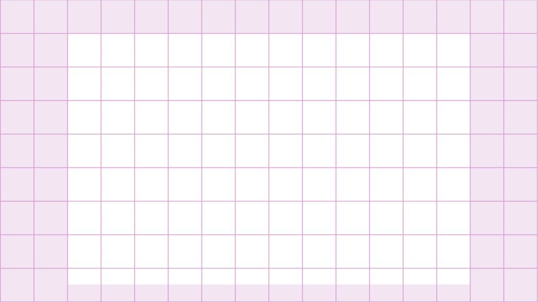
This grid is the backbone for the balanced and consistent layout of all graphic elements in our videos. This is an example of the 16:9 video grid. It includes 16 horizontal squares and 9 vertical squares, with safe zone. Avoid content on outer squares marked with pink. Vertical and square format grids can be found at the end of video page. The bottom row should only be used for subtitles and text panel.
Typographic styles
Always use the Finnair Sans typography in videos. Our videos use Regular, Medium and Bold font weights.
Below is the typographic text size and line height unit chart for different video sizes for Adobe After Effects, Adobe Premiere Pro and Final Cut Pro. The first number in the table is the font size in pixels, second is the height of leading in percentages.
| Empty table cell |
Weight |
Full HD |
4K |
8K |
Instagram feed 1080x1350 and mobile 1080x1920 |
|
Main headline |
Bold |
145px / 110% |
290px / 110% |
580px / 110% |
145px / 110% |
|
Section headline |
Bold |
110px / 120% |
220px / 120% |
440px / 120% |
110px / 120% |
|
|
|
|
|
|
|
|
Topline for main headline and section headline |
Regular |
65px / 120% |
130px / 120% |
260px / 120% |
65px / 120% |
|
Subline for main headline and section headline |
Regular |
65px / 120% |
130px / 120% |
260px / 120% |
65px / 120% |
|
|
|
|
|
|
|
|
Highlight text |
Medium |
80px / 120% |
160px / 120% |
320px / 120% |
80px / 120% |
|
|
|
|
|
|
|
|
Text panel - Name |
Regular |
55px / 100% |
110px / 100% |
220px / 100% |
55px / 100% |
|
Text panel - Title |
Regular |
40px / 120% |
80px / 120% |
160px / 120% |
40px / 120% |
|
|
|
|
|
|
|
|
Subtitle |
Medium |
55px / 120% |
110px / 120% |
220px / 120% |
55px / 120% |
Placement of typography
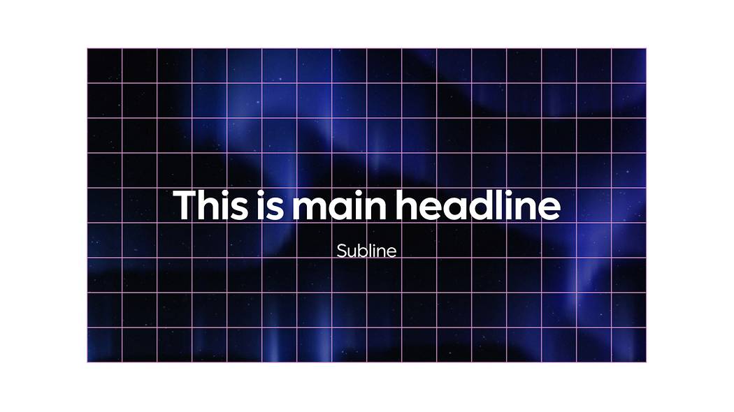
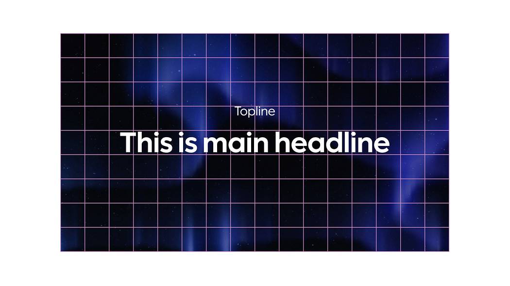
Main headline for opening view
Headline texts should be kept compact and inside safety borders.
Main headline
Finnair Sans Bold
Vertical and horizontal center align
|
Full HD |
145px / 110% |
|
4K |
290px / 110% |
|
8K |
580px / 110% |
|
Instagram feed and mobile |
145px / 110% |
Subline for main headline
Finnair Sans Regular
Aligned to the bottom line of the square underneath headline
|
Full HD |
65px / 120% |
|
4K |
130px / 120% |
|
8K |
260px / 120% |
|
Instagram feed and mobile |
65px / 120% |
Topline for main headline
Finnair Sans Regular
Aligned to the top line of the square above headline
|
Full HD |
65px / 120% |
|
4K |
130px / 120% |
|
8K |
260px / 120% |
|
Instagram feed and mobile |
65px / 120% |
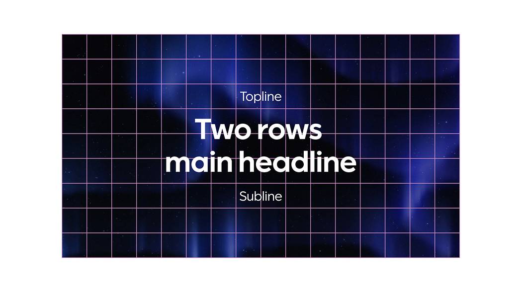
Two rows main headline
Vertical and horizontal center align
Topline and subline for two rows main headline
Aligned to the middle of the square above or underneath the headline
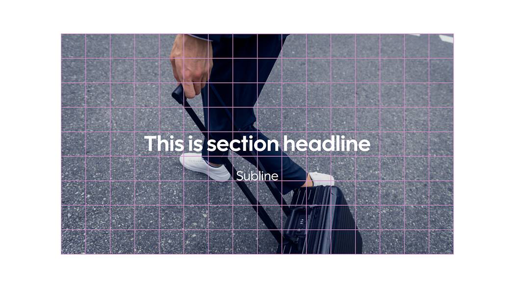
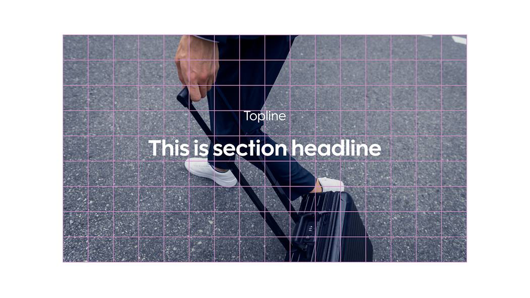
Section headline
Use section headlines as opening views when you want to separate different sections of the video.
Section headline
Finnair Sans Bold
Vertical and horizontal center align
|
Full HD |
110px / 120% |
|
4K |
220px / 120% |
|
8K |
440px / 120% |
|
Instagram feed and mobile |
110px / 120% |
Subline for section headline
Finnair Sans Regular
Aligned to the bottom line of the square underneath section headline
|
Full HD |
65px / 120% |
|
4K |
130px / 120% |
|
8K |
260px / 120% |
|
Instagram feed and mobile |
65px / 120% |
Topline for section headline
Finnair Sans Regular
Aligned to the top line of the square above section headline
|
Full HD |
65px / 120% |
|
4K |
130px / 120% |
|
8K |
260px / 120% |
|
Instagram feed and mobile |
65px / 120% |
Two rows section headline
Vertical and horizontal center align
Topline and subline for two rows section headline
Aligned to the middle of the square above or underneath section headline
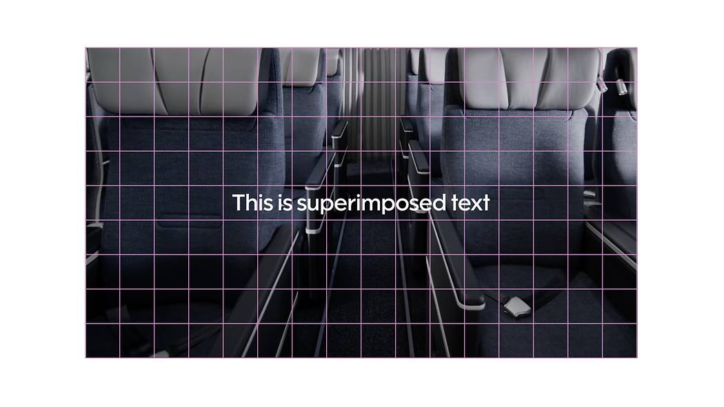
Super texts
Supers are both horizontally and vertically centered texts that can be either superimposed on the underlying footage or appear on a single colour background. These can be feature texts, slogans, call-to-actions etc.
Primary color for texts is white. Use blue super text only when the background is 100% white.
Super text
Finnair Sans Medium
Aligned to horizontal and vertical center
Use subtle shadow effect to increase visibility, if necessary
|
Full HD |
80px / 120% |
|
4K |
160px / 120% |
|
8K |
320px / 120% |
|
Instagram feed and mobile |
80px / 120% |
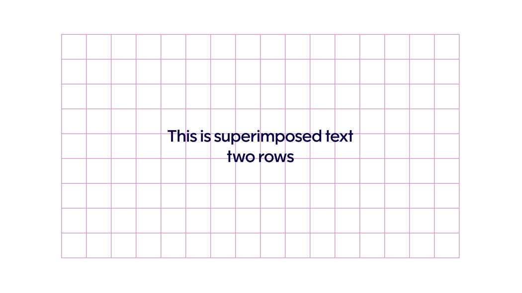
Two rows super text
Aligned to horizontal and vertical center
Blue super text
Use blue super text on white background Finnair blue #0C0243
Lower thirds
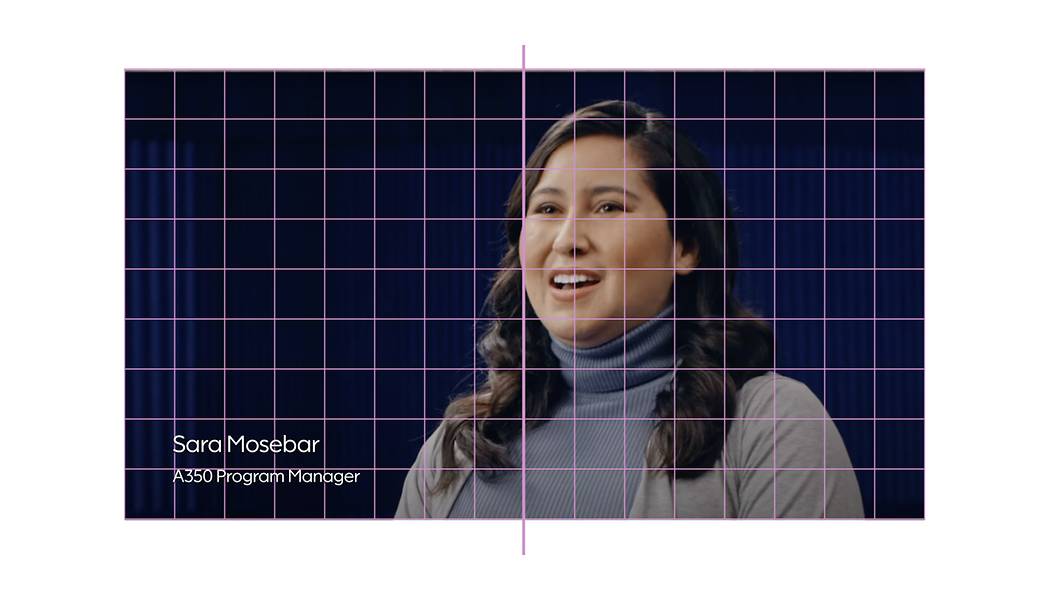
Lower thirds are superimposed text in the lower third of the screen. These texts would be used to identify a person or location on screen, for example.
Lower third with name and title
Finnair Sans Regular
Avoid using content that covers more than 7 grid squares. When you create or film material for Finnair, make sure to design the interview situation so that the person is always located on the right half of the screen, with enough calm space on the left-hand side, lower third area of the screen left for the name and title.
| Name |
empty |
|
Full HD |
55px / 100% |
|
4K |
110px / 100% |
|
8K |
220px / 100% |
|
Instagram feed and mobile |
55px / 100% |
| Title |
empty |
|
Full HD |
40px / 120% |
|
4K |
80px / 120% |
|
8K |
160px / 120% |
|
Instagram feed and mobile |
40px / 120% |
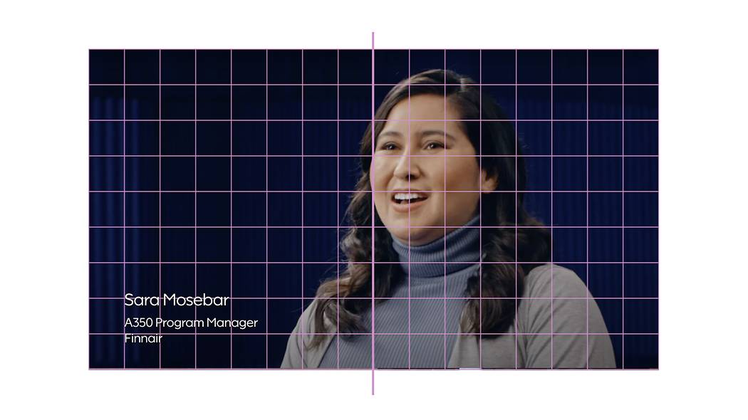
Lower third with name and title, two rows
Sometimes you need to use two rows with title texts. Place the lower title row to the top of the bottom square grid.
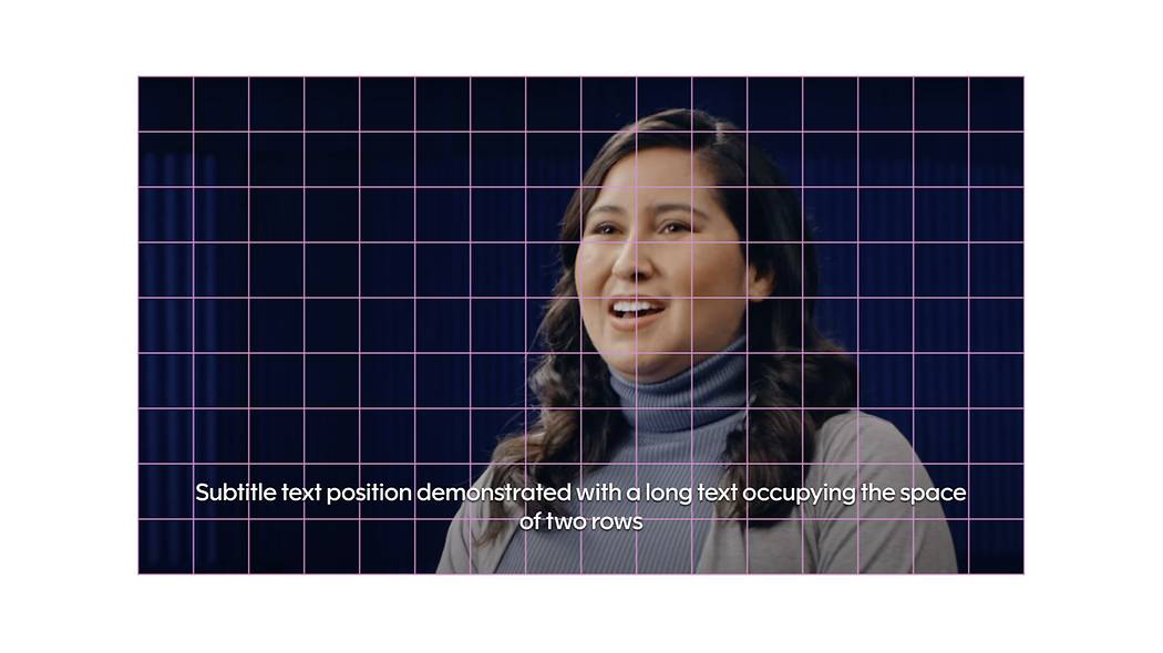
Subtitles
Our videos can be adapted into various languages using subtitles. The use of subtitles in videos can also improve user experience, especially for mobile users and on social media, where sounds are often turned off by default.
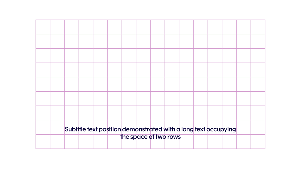
Subtitle text
Finnair Sans Medium
First line is aligned in the middle of second square from the bottom. Text alignment is always center. Adding combination of drop shadows to the text will add contrast to the light backgrounds.
|
Full HD |
55px / 120% |
|
4K |
110px / 120% |
|
8K |
220px / 120% |
|
Instagram feed and mobile |
55px / 120% |
|
1st drop shadow: 0px 4px 4px rgba(0, 0, 0, 0.05)
2nd drop shadow: 0px 1px 2px #000000;
|
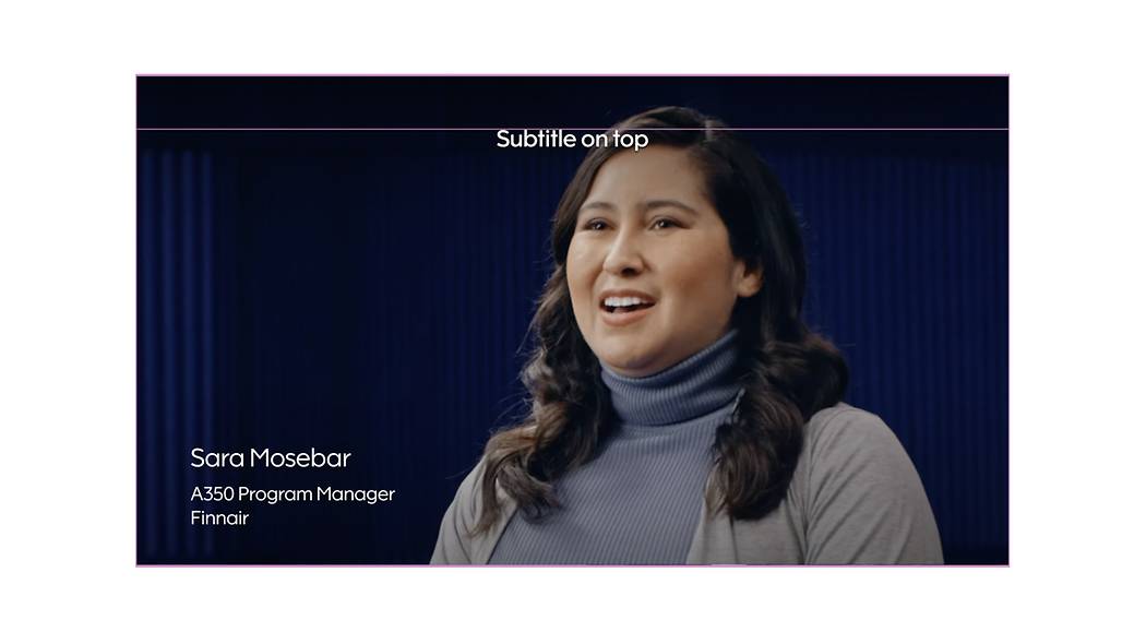
Use the top align when the text panel is in use and when there’s content that needs to be visible. Subtitles should never be placed directly on top of the speaker's face.
Blue subtitle text
Use blue subtitle text on 100% white background only.
The colour the text is Finnair Blue #0C0243.
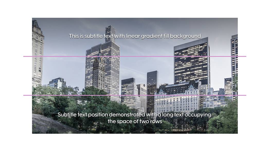
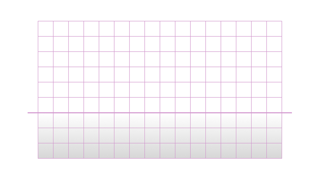
Enhancing subtitle visibility
Please note the linear gradient fill behind the subtitle texts. Use the fill only when accessibility is at risk. The linear fill is always full width and extends to 3 grid squares from bottom or top of screen.
This example demonstrates only the use of gradient fill. Top and bottom subtitles do not appear at the same time.
Example of linear gradient fill on the bottom.
Example of linear gradient fill on the top
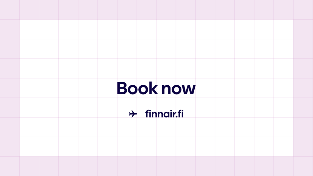
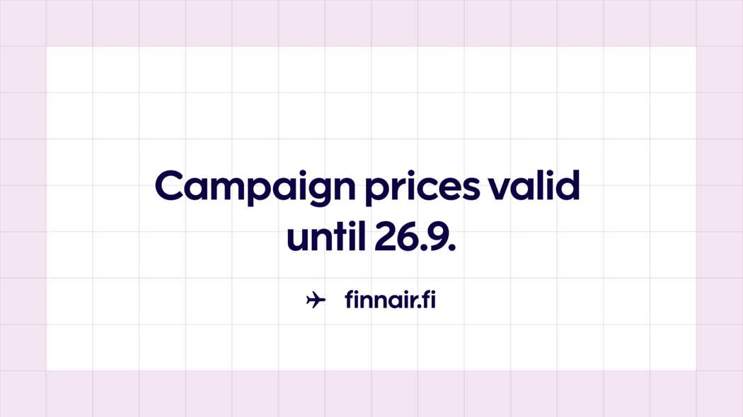
Call to action
A call-to-action is a prompt that guides the user to take specific action. Our CTA's are always followed with an aircraft icon and our website address/URL.
The main text should be always center aligned. The bigger text size is same as Section headline. The address text size is same as Subline. The address is attached to the next square grid bottom.
The text will stay center aligned vertical when there is need for a second line in the bigger text. Please note that the address text moves down the same amount that the bigger text grows.
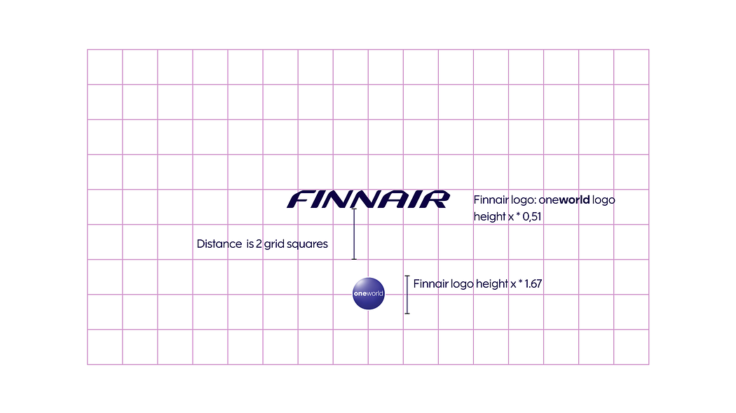
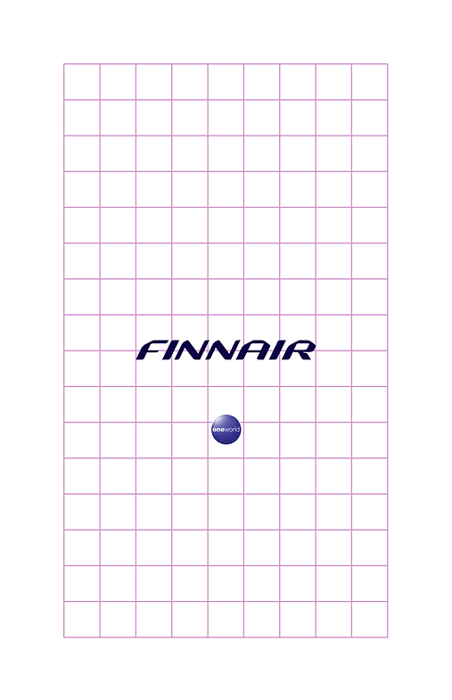
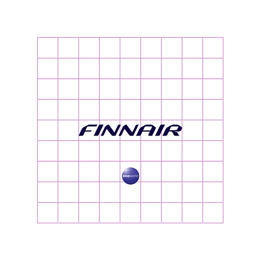
Placement of logos
Closing view
Here are guidelines on the use of Finnair logo and oneworld logo for 16:9 format, square and vertical video
oneworld logo size is one square grid. In the middle of the grid. The height of the oneworld logo is always 1,67x to the Finnair logo height. The position of the oneworld logo is 2 grid square from Finnair logo
Finnair logo takes five square grids. In the middle of the grid. The height of the oneworld logo is always 1,67 to the Finnair logo height. The position of the oneworld logo is 1,5 grid square from Finnair logo.
Finnair logo takes five square grids. In the middle of the grid. The height of the oneworld logo is always 1,67 to the Finnair logo height. The position of the oneworld logo is 2 grid square from Finnair logo