-
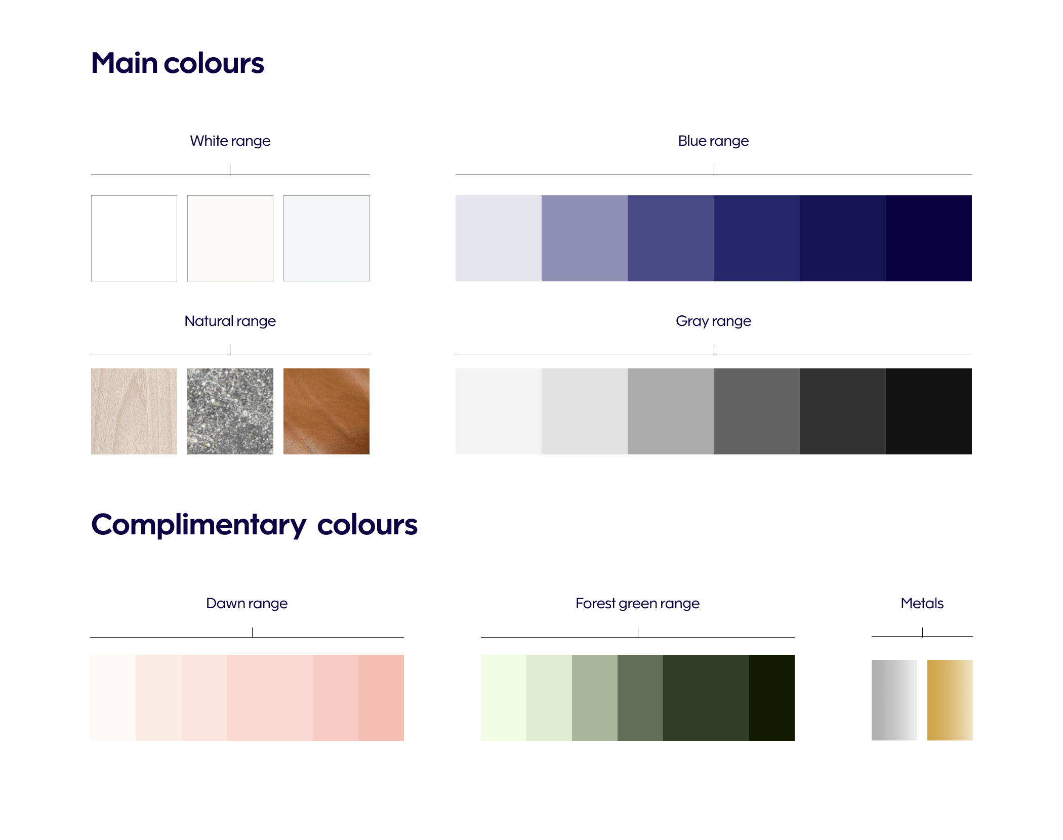
Spatial palette
Spatial palette consists of main and complimentary colours. Main colours create a solid colour base for Finnair spaces. Complimentary colours add warmth and depth and a more intimate impression to the interiors. The palette as a whole represents the modern Nordic design aesthetic.
The colour ranges represent the lightness scale of a colour. These ranges allow for the use of several different tones of the given colour, lending a layered effect and tonal variety to the interiors.
For selected loose items and brand collaborations, colours can be paired by combining a colour from the complimentary palette with the Finnair Blue brand colour, or using different tones within a range. This kind of colour pairing should be used very sparingly to give a little pop and vibrance to the interiors. The Marimekko textiles and loose items on-board Finnair aircrafts serve as an example of this.