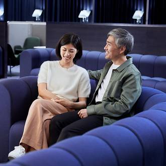
Each space we welcome our customers into should feel inclusive, modern and relaxing. From sustainable natural textures to timeless Nordic colours, discover how to use colour zoning, branding and materials to create harmonious spaces.
Spatial guidelines
Finnair spaces
Our brand attributes guide our spatial design and experience. Our design is driven by functionality combined with a recognisable, fresh Nordic touch. We believe that the most efficient solutions are often stunningly beautiful in their simplicity. We embrace the diversity of our Nordic nature and its seasons’ highlights as a source of continuous inspiration.
Our ambience is unified
The Nordic design heritage has always influenced the way we create space. We’ve carefully defined our unique design language, materials, structures, lighting and colours to support and tell our story. The Finnair look and feel is experienced strongly and consistently in our spaces, giving our customers a little piece of the Nordics every time they fly with us.
Branding principles
Logo and emblem use in space
Finnair logo
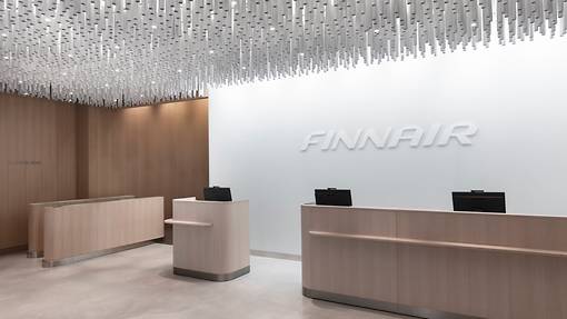
The logo is mainly used in branding elements such as guidance, graphic materials, signposts and screens where brand recognisability is imperative. The logo should be used as an informative branding element when entering a Finnair space.
F emblem
The emblem is our symbol of quality and it is used for defining ownership of spaces with its elegant form and presentation. It is the preferred visual branding element inside Finnair spaces. This element is used for branding e.g. on desks, surfaces and furnishings.
Please note:
Branding is done according to the Finnair brand guidelines. These elements should be used sparingly and elegantly to avoid them becoming too dominant or duplicated or disturbing the simplicity of the space.
Finnair logo
F emblem

Colours and materials
Overview
Finnair White and Finnair Blue, along with Finnair Rock, are the foundation of the Finnair colour palette, and should be reflected in any spatial colour use as well. In branded Finnair spaces, these colours are matched with natural materials and complimentary colours to create diverse, inviting and harmonious experiences.
The material choices are sustainable, timeless, and natural. The feeling of the materials conveys the Nordic essence of nature and progressiveness.
In addition to creating mood and ambience, colour choices play a functional role in Finnair spaces. The core brand colours are used to give structure to different spatial concepts. The elegant and calming appearance of the Finnair Blue invites travellers to rest and unwind during their trip. The clean Finnair White serves a more functional backdrop for activities such as meal services.
Finnair colour palette is used to create inviting and harmonious spatial experiences.
Finnair Blue invites travellers to rest and unwind during their trip.
Material choices are sustainable, timeless and natural.
Brand colours
Master palette
Master palette is combination of clean Finnair White and iconic Finnair Blue. In addition, the palette contains selected shades of Finnair Rock and energetic Finnair Heather to draw attention. More information on the Finnair brand colours can be found in the Brand basics section.
Brand colour usage in space
The blue, white and gray ranges in the spatial palette are derived from main brand palette. These serve as foundational colours in Finnair spatial design. In spatial design these colours can be used with more tonal and material variety.
Finnair Heather
Finnair Heather is used as a highlight colour in selected Finnair marketing materials and digital experiences, which might be present also in Finnair spaces. The use of heather in spatial and interior design is not recommended.
Finnair White
HEX #ffffff
RGB: 255, 255, 255
CMYK C: 0, 0, 0, 0
CMYK U: 0, 0 ,0, 0
RAL 9003
Finnair Blue
HEX #0C0243
RGB: 12, 2, 67
CMYK C: 100, 80, 0, 65
CMYK U: 100, 80, 0, 45
Newsprint CMYK: 100, 70, 0, 40
PMS 2767 C
RAL 5026
Finnair Heather
HEX #7F1F89
RGB: 127, 31, 137
CMYK C: 60, 100, 0, 0
CMYK U: 60, 100, 0, 0
Newsprint CMYK: 50, 100, 0, 0
PMS 2612 C
Finnair Rock
HEX #AFAFAF
RGB: 175, 175, 175
CMYK C: 0, 0, 0, 40
CMYK U: 0, 0, 0, 35
Newsprint CMYK: 0, 0, 0, 30
PMS Cool Gray 6 C
PMS Cool Gray 5 U
RAL 7040
Finnair Black
HEX #121212
RGB: 18, 18, 18
CMYK C: 0, 0, 0, 100
CMYK U: 0, 0, 0, 100
Newsprint CMYK: 0, 0, 0, 100
PMS Black C
PMS Black U
RAL 9017
Colour usage ratio
60%
35%
5%
Spatial palette
Spatial palette consists of main and complimentary colours. Main colours create a solid colour base for Finnair spaces. Complimentary colours add warmth and depth and a more intimate impression to the interiors. The palette as a whole represents the modern Nordic design aesthetic.
The colour ranges represent the lightness scale of a colour. These ranges allow for the use of several different tones of the given colour, lending a layered effect and tonal variety to the interiors.
For selected loose items and brand collaborations, colours can be paired by combining a colour from the complimentary palette with the Finnair Blue brand colour, or using different tones within a range. This kind of colour pairing should be used very sparingly to give a little pop and vibrance to the interiors. The Marimekko textiles and loose items on-board Finnair aircrafts serve as an example of this.
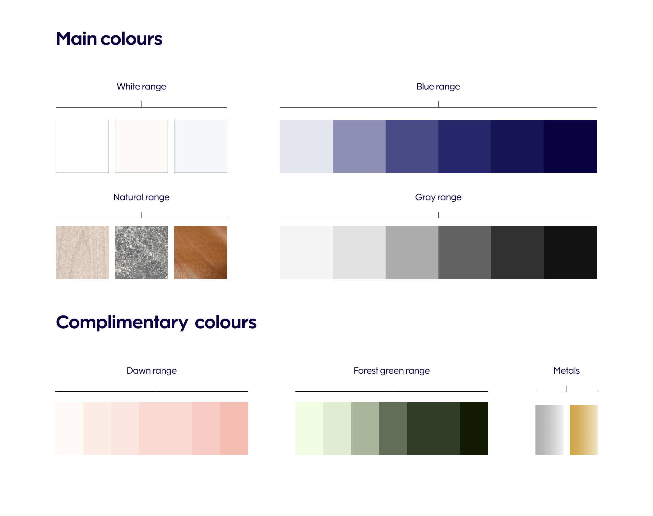
Main colours
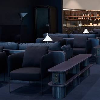
White, blue and gray colour ranges are used broadly in space, appearing on walls, floors, ceilings and the most visible furniture choices.
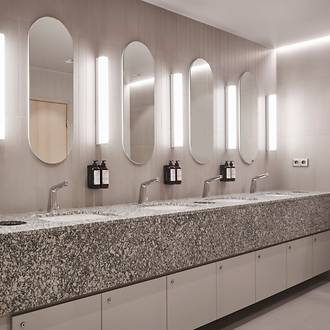
The natural range consists of selected materials such as wood, stone and leather. Natural or uncoloured light wood – like ash – and fresh green plants are important elements for providing a connection to the Nordic nature. The natural range is used in interior surfaces and details, (such as wood panelling and granite stone table tops), to reinforce Nordic character and give warmth to a space.
Finnair Blue and Finnair White can also be used for separating certain areas, so that it fills the entire area from top to bottom. Reference to relaxing and activity zones. Finnair Blue is also tied with the more exclusive priority services. The more exclusive the surroundings (e.g. Business Class, Platinum Wing lounge), the greater role blue takes in the space as well.


Move carousel to position 0
Move carousel to position 1
Move carousel to position 2
Complimentary colours
We use tones of Dawn and Forest green in textiles and furniture upholstery. These colours appear in small scale to give a little pop and vibrance to the interiors. Metals are sophisticatedly used in interiors as accents and finishing touches. Silver, being a part of the brand colour palette, is the preferred metal finish for Finnair spaces. Gold is reserved only as a highlight for the most premium occasions.
Complimentary colour references from the Pantone system:
• Dawn: 2337 C
• Forest green: 5605 C


Move carousel to position 0
Move carousel to position 1
Move carousel to position 2
Implementation guidelines
Logo implementation
Prefer grooved or three-dimensional logos on a white or light-coloured background with a Nordic look and feel, instead of flat taped or printed surfaces, to get the most polished result.

Blue thin logo on white or light grey background
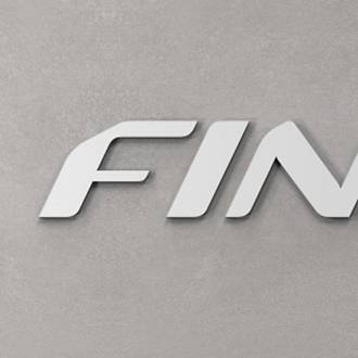
Blue three-dimensional logo on white or light grey background
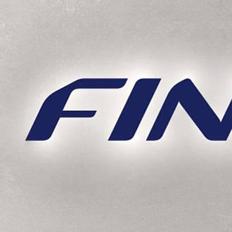
Blue logo lit from behind on white or light grey background

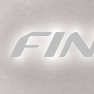
White lit logo on light grey background
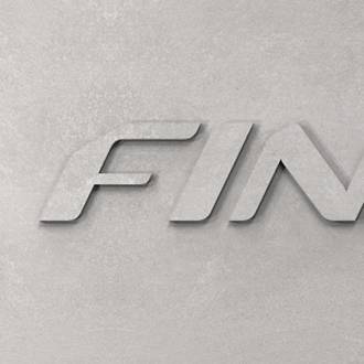
White three-dimensional logo on light grey background
White logo lit from behind on light grey background

Grooved logo on white or light grey surface
Light grey three-dimensional logo on same-coloured background

Light grey logo lit from behind on same-coloured background
Blue logos are used in locations where visible customer guidance is required.
Read next