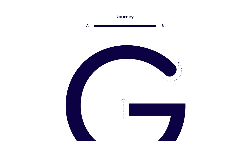
Ready for liftoff? We’ve crafted a bespoke typeface which uses light, aerodynamic curves to convey an uplifting sense of optimism. Here you can find clear and simple guidelines, hierarchies and presentation rules for using Finnair Sans across both physical and digital touchpoints.
Typography
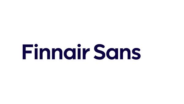
Finnair Sans
Finnair Sans is a digitally optimised, functional typeface, inspired by aerodynamic forms and the concept of a journey. Rounded letter shapes give Finnair Sans an optimistic and humanistic character. Our typography minimises friction.
Design concept
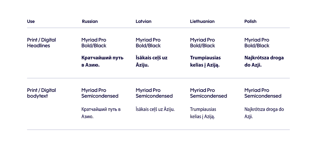
Thin
Finnair Sans
Light
Finnair Sans
Regular
Finnair Sans
Medium
Finnair Sans
Bold
Finnair Sans
Black
Finnair Sans
Thin
AaBbCcDdEeFfGgHhIiJjKkLlMmNnOoPpQqRrSsTtUuVvWwXxYyZz 1234567890!?&€$¢¥£%-;#
Light
AaBbCcDdEeFfGgHhIiJjKkLlMmNnOoPpQqRrSsTtUuVvWwXxYyZz 1234567890!?&€$¢¥£%-;#
Regular
AaBbCcDdEeFfGgHhIiJjKkLlMmNnOoPpQqRrSsTtUuVvWwXxYyZz 1234567890!?&€$¢¥£%-;#
Medium
AaBbCcDdEeFfGgHhIiJjKkLlMmNnOoPpQqRrSsTtUuVvWwXxYyZz 1234567890!?&€$¢¥£%-;#
Bold
AaBbCcDdEeFfGgHhIiJjKkLlMmNnOoPpQqRrSsTtUuVvWwXxYyZz 1234567890!?&€$¢¥£%-;#
Black
AaBbCcDdEeFfGgHhIiJjKkLlMmNnOoPpQqRrSsTtUuVvWwXxYyZz 1234567890!?&€$¢¥£%-;#
Finnair fonts
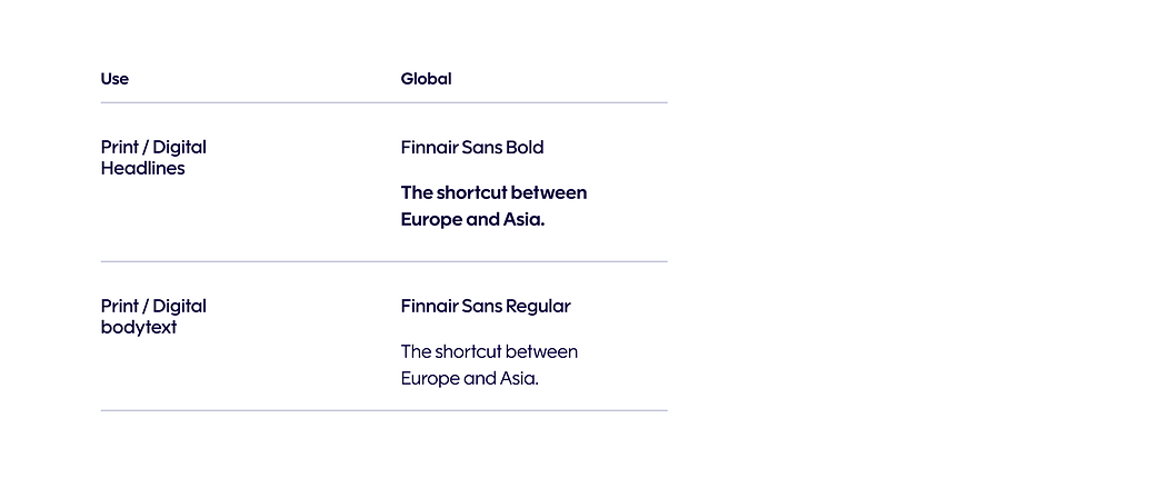
1. All external, customer-facing touchpoints
Finnair Sans is an identifiable typeface created exclusively for Finnair. It is to be used in Finnair brand communication whenever possible. Use Arial as a fallback font for Finnair Sans.
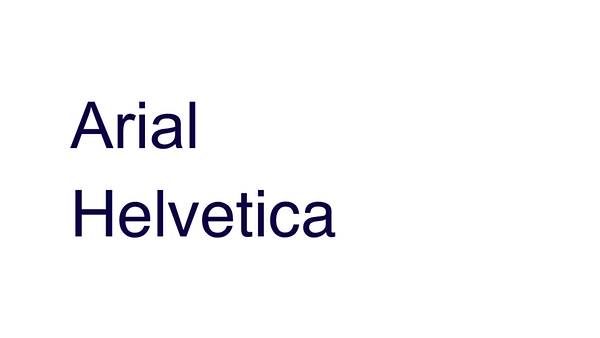
2. Daily office use and presentations, fallback fonts
The primary font for daily office use is Arial, with Helvetica being the secondary backup. These fonts are used because are generally available (for example in Microsoft Office). These fonts do not require special fonts in the recipient’s computer, so open documents can be kept in a consistent way in a digital environment.
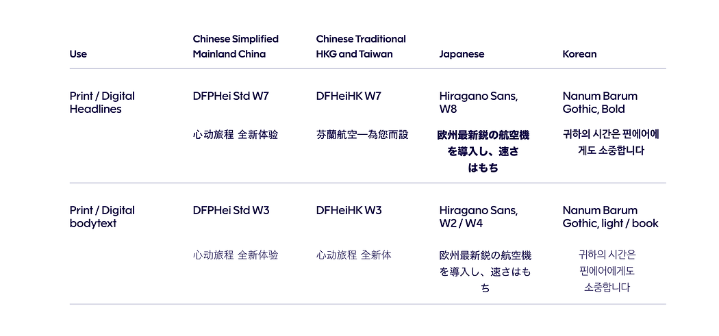
International font substitutes
Global
East-European languages
Asian languages
Hierarchy
A strong hierarchy helps create clarity and consistency in communication.
Use cases help choose right typographic styles according to the relative importance and function of text, while maintaining a recognisable brand style.
Maintain the recommended headline-subline proportions and font pairings.
Pairings
Headline pairing 1
Headline pairing 2
Use case
Attention and emphasis
This hierarchy style is used in opening titles and informative text that requires special attention or emphasis. See examples for reference. Type sizes can be freely selected. Follow minimum spacing guidelines between the text hierarchies (headline, subheadline, topline, body).
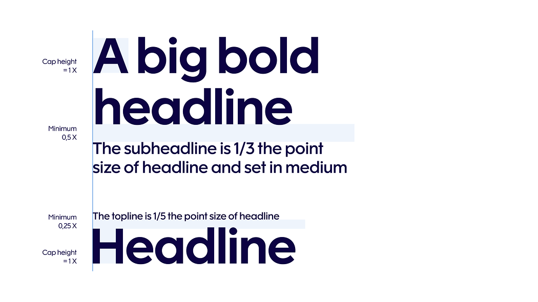
Headline
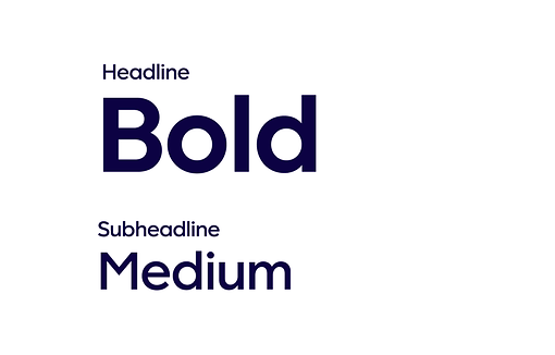
Finnair Sans Bold
100% leading
-15 tracking
Subheadline
Finnair Sans Medium
1/3 headline point size
110% leading
0 tracking
Topline
Finnair Sans Medium
1/5 headline point size
110% leading
0 tracking
Example 1
Example 2
Basic presentation
This hierarchy style is used in basic presentations and is staple style for general materials, corporate communications and in publications. Type sizes can be freely selected. Follow minimum spacing guidelines between the text hierarchies (headline, subheadline, topline, body).
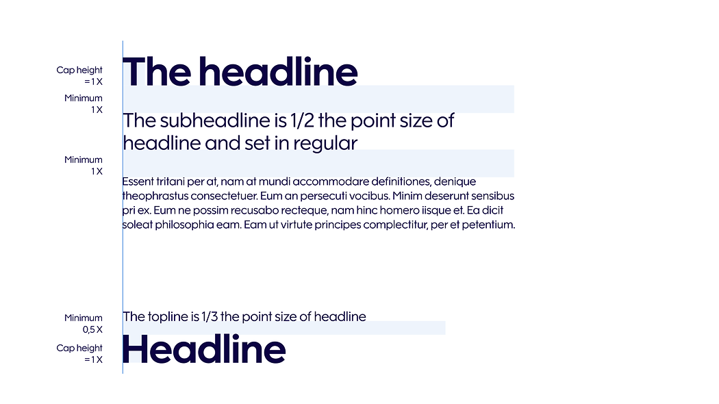
Headline
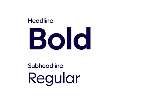
Finnair Sans Bold
100% leading
-10 tracking
Subheadline
Finnair Sans Medium
1/3 headline point size
110% leading
0 tracking
Body copy
Finnair Sans Regular
Freely selected point size
120% leading
0 tracking
Topline
Finnair Sans Regular
1/3 headline point size
110% leading
0 tracking
Example 1
Example 2
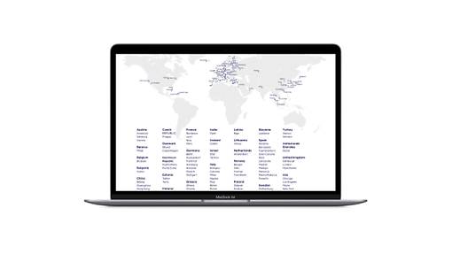
Informative content
This is a high level hierarchy style for informative content such as body copy text and lists. Type sizes can be freely selected. Follow minimum spacing guidelines between the text hierarchies (headline, subheadline, topline, body).
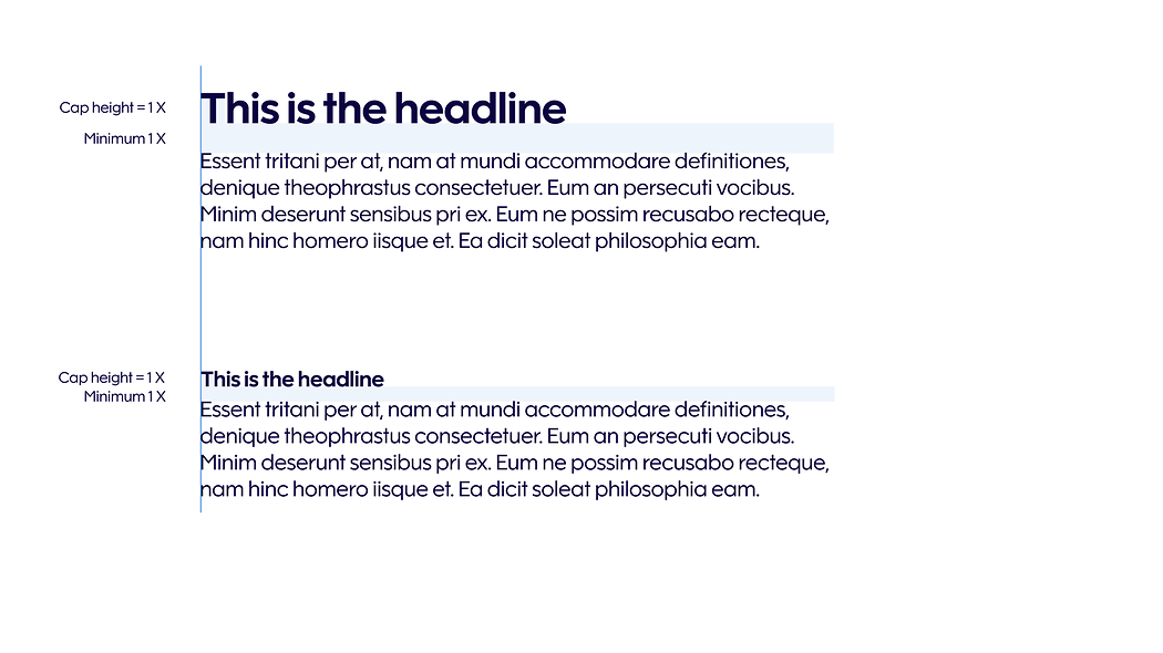
Headline
Finnair Sans Bold
100% leading
0 tracking
Body copy
Finnair Sans Regular
1/2 headline point size
120% leading
0 tracking
Headline
Finnair Sans Bold
100% leading
0 tracking
Body copy
Finnair Sans Medium
1/1 headline point size
120% leading
0 tracking
Example 1
Example 2
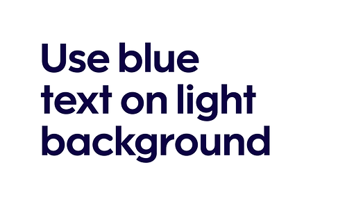
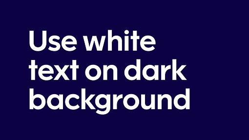
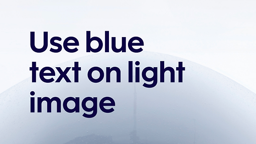
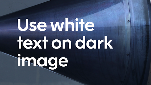
Text, colour and image guidance
All brand level texts are set in blue unless they appear on a dark background. Blue text is used on top of light images. White text is used on dark images.
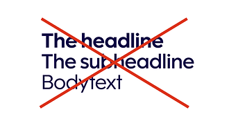
Prohibited use of typography
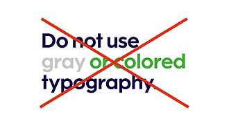
Use only blue or white colour in text.
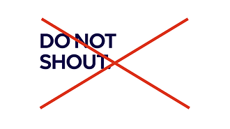
Do not use all caps.
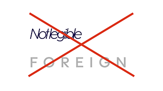
Do not create foreign text styles, or adjust kerning or tracking.
Do not make different hierarchy levels the same point size.
Read next